Spectra, waterfall plots and spectrograms
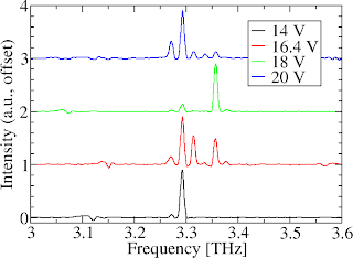
 Often, people present a plot that looks something like the one on the right. Here, I measured the emission from a laser, using four different drive voltages. The spectra are a bit different each time, but they are all centred around the same frequency (3.31 THz). I've plotted them all on the same axes by normalising each spectrum (i.e., setting the peak amplitude of each spectrum to 1 unit), and then showing each spectrum offset against the others.
I think most people are perfectly happy with reading data from figures like this one, but there are a couple of issues that I've never been entirely comfortable with:
- The vertical scale on the graph is fairly meaningless: the spacing between the 14 V and 16.4 V lines is identical to the spacing between the 16.4 V and 18 V lines, even though the actual step in voltage is bigger in the first case.
- The lines in the graph don't intrinsically tell you the full story... for example, you need to look at the legend to understand that "Red line = 16.4 V". Without the legend, the graph would be useless. With the legend, you have more clutter in the image, and an extra mental step to complete before understanding the data.
- It's sometimes a bit tricky to see trends in the data. I don't know much about the psychology of this... I guess it's something to do with reading each curve separately and then mentally "post-processing" it to spot a pattern.
One solution is to use a "waterfall plot" or "fence plot" (see MATLAB documentation). This represents the data in three-dimensions, with the curves being stacked in front of each other at a position corresponding to the voltage/temperature/whatever. Pretty useful, but again there are some problems: principally, the figures contain lots of lines, making it quite difficult to represent the data neatly in a journal article where very small figure sizes are needed. Secondly, it's a bit tricky to read the data from a 3D plot: figuring out exactly what the frequency of a peak, and the voltage used isn't easy!
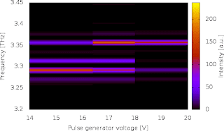
 So, I prefer using a kind of spectrogram to represent this sort of data, such as the image to the right. Here, the voltage is shown across the horizontal axis (in a normal spectrogram it would be time), and the frequency of the laser is shown vertically. The brightness of each region of the spectral map shows how intense the emission is at a given frequency, when the laser is driven at the specified voltage.
I'm not advocating this sort of visualisation as being intrinsically better than others, but (a) it's more colourful and can liven up a presentation a bit and (b) personally, I find it quicker to read the data and spot trends. On the down side, it is important to note that the horizontal scale only actually represents four voltage readings. It's easy to make wrong assumptions about the behaviour at other voltages because the colours are painted continuously across the chart. For example, the chart indicates that the brightest emission line at 15 V will be somewhere just below 3.3 THz. In reality, it could be entirely different; the graph is just filling in the gap in our knowledge with the data we acquired at 14 V.
How to plot spectrograms in Gnuplot
Right, enough waffle. How did I actually generate the image above using Gnuplot?
First, I arranged my data in a file called "spectra-vs-voltage.dat" in the following form:
First, I arranged my data in a file called "spectra-vs-voltage.dat" in the following form:
14 4.49931 0.85137

14 4.49819 0.82508

14 4.49708 0.78786

14 4.49597 0.73671

14 4.49485 0.67282


16.4 4.49931 0.75230

16.4 4.49819 0.84287

16.4 4.49708 0.79419

16.4 4.49597 0.65894

16.4 4.49485 0.48719
So, it's in three columns, containing
- Bias voltage (or temperature, or time, or whatever you want on the horizontal scale)
- Frequency
- Spectral intensity
Note that I have placed a line-break between the data set for each voltage. This is important! Note also that I have only shown the first five values for the first two data sets. You wouldn't want to read the thousand or so frequency points for each of the four spectra! Finally, note that the frequencies are in reverse order in the data sets (i.e., starting at the highest frequency of 4.49931 THz and working backwards.). This is because our spectrometer measures in wavenumbers, and therefore the data appears in reverse in terms of frequency. This isn't important; the plotting method I use doesn't care which way round the data is presented.
I then made a little Gnuplot script in a text editor (VIM), and saved it as "spectral-map.gnuplot". It reads as follows:
#! /usr/bin/gnuplot

set pm3d map

splot 'spectra-vs-voltage.dat'

set terminal png crop

set output 'spectral-map.png'

set xlabel 'Pulse generator voltage [V]'

set ylabel 'Frequency [THz]'

set cblabel 'Intensity [a.u.]'

set cbrange [0 to GPVAL_DATA_Z_MAX]

set xrange [GPVAL_DATA_X_MIN to GPVAL_DATA_X_MAX]

set yrange [3.2 to 3.45]

unset key

replot

unset output
I made the script executable using "chmod +x spectral-map.gnuplot", and then generated the plot by running the script: "./spectral-map.gnuplot". If you care how the script works, or want to modify it, read on. Otherwise, happy plotting :)Explanation of script
- The first line is a standard instruction (the "shebang" line), which tells UNIX that this file can be interpreted by Gnuplot.
- The set pm3d map line sets the plotting style as a 2D colour map of some three-dimensional data
- The splot 'spectra-vs-voltage.dat' line generates a preliminary plot of the data, without any special formatting. By default, this will normally flash up on your screen, and then disappear when Gnuplot finishes. In fact, I only did this preliminary plot as a bit of a hack so that Gnuplot can figure out the range of the data in the input file. It works fine, but I'm sure there is a better way to do this... flashing unneeded windows around on the screen feels ugly!
- The set terminal png crop line says that we want the final image to be rendered to a PNG image file, and for any whitespace around the edges to be cropped away.
- The set output 'spectral-map.png' line instructs Gnuplot to open a file called "spectral-map.png", ready for us to write the image.
- The set xlabel line (and the following ylabel and cblabel lines) set the labels on the x-axis, the y-axis and the colourbar.
- The set cbrange line sets the limits of the data to appear in the colourbar. Anything intensities lower than 0 will appear black in the image. The maximum value is obtained using the GPVAL_DATA_Z_MAX variable, which corresponds to the highest intensity value in the preliminary plot we drew in line 3.
- Similarly, the xrange and yrange commands set the range of data on the x and y-axes.
- The unset key command hides an annoying line of text in the image containing the data filename.
- The replot command regenerates the plot, this time using the desired formatting (ranges, labels etc). Note that this time, the plot is written into our PNG output file, rather than to screen because we changed the terminal in line 4.
- Finally, we have finished writing the image into our PNG output file, so we tell Gnuplot to close it by writing unset output.
That concludes the explanation. Let me know if anything needs clarification!