Monday 3 November 2014

Finding eigenvalues of sparse matrices in C++

Just a quick note about the headaches I've been having when trying to find the eigenvalues of sparse matrices in my C++ simulation programs. Essentially, I just want to solve a problem of the type: \[\mathsf{H}\mathbf{x} = E\mathbf{x}\], where \(\mathsf{H}\) is a square matrix, \(\mathbf{x}\) is an eigenvector of the matrix and \(E\) is the corresponding eigenvalue. I'm handling quite large matrices (say, \(5000\times 5000\) elements) so a general eigenvalue solver takes an extremely long time to solve. In fact, the matrices I'm dealing with are tridiagonal (i.e., only the diagonal and the bands either side of it contain non-zero elements) and this, in theory at least, makes it possible to solve the problems much more rapidly. However, my matrices are not symmetrical, and this causes some difficulties! I've found three possible library approaches for solving this, none of which are ideal:

LAPACK

LAPACK provides (slow) solvers for general eigenvalue problems, and very fast solvers for symmetric tridiagonal systems. Unfortunately, there doesn't appear to be a solver for non-symmetric tridiagonal systems. LAPACK is a FORTRAN library, but since version 3.4, there are some convenient C/C++ bindings that can be used.

ARPACK

ARPACK seems to be the best/fastest sparse-matrix solver around, but using the raw API looks extremely painful (you need to manually iterate the solver). I did find a C++ wrapper (ARPACK++), but development seems to have been abandoned, the API is still quite arcane, and documentation is pretty sparse. There's an excellent Python wrapper as part of SciPy... now, if someone could do this in C++, I'd be very happy!

Armadillo

The Armadillo library has, in fact, started wrapping ARPACK functionality for C++, and the API is very user-friendly. The only problem is that the sparse-matrix algorithm converges first on the eigenvalues with largest magnitude... I want the smallest ones! It is possible to request the smallest magnitude solutions, but the algorithm fails to converge within Armadillo's hard-coded iteration limit for many cases. ARPACK itself provides some very handy ways around this problem, which haven't yet been fully implemented in the Armadillo wrapper. These are:
  • Increase the tolerance on precision of the solution. This has been implemented in Armadillo, but it's not an ideal solution since the eigenvalues are found to a lower precision.
  • Increase the maximum number of iterations. This essentially gives ARPACK more time to find the solution. It's not yet available in Armadillo, but it's a bit of a brute-force approach, because obviously it can take a very long time. I don't know the details of the algorithm, but I'd be concerned about the stability... potentially, I guess it could be possible to get stuck in an oscillation or to hit a divergent condition. In this case, increasing the maximum number of iterations wouldn't help!
  • Use a shift-and-invert algorithm. This approach preconditions the eigenvalue problem such that the eigenvalues are transformed \[E\to\frac{1}{E-\sigma}\], where \(\sigma\) is a "pivot" point near to the desired solutions. In my case, \(\sigma = 0\) is a decent choice, because I'm actually looking for the energies of electrons close to the bottom of an energy band. This approach transforms the problem so that the algorithm works in its "preferred" mode of finding the largest eigenvalues first.
I exchanged a couple of emails with the Armadillo developers a few months ago, with a view to getting the latter functionality into a new version. They were very helpful, and hopefully some day I will get round to implementing the feature in their wrapper and sending them a patch. Until then, I'm stuck with either using very slow general eigenvalue solvers, or very complex APIs!

Friday 10 October 2014

Figure references in MS Word and LaTeX ("Figure" vs. "Fig.")

Reason #98856 why I hate Microsoft Word: It's incredibly difficult to caption and cross-reference figures in a flexible way. Many journals have style rules that require you to refer to figures as "Figure 1" at the start of a sentence, or "Fig. 1" in the middle of a sentence. In LaTeX, this is super easy:
  1. Label the figure using
    \caption{\label{example} (a) blah (b) whatever.}
    
    Label the figure using
    \caption{\label{example} (a) blah (b) whatever.}
    

  2. In the document, type:
    This is shown in Fig. \ref{example}"

  3. Save and compile.
How to do it in MS Word:
  1. Insert a caption under Figure 1:
    1. References -> Captions -> Insert Caption
    2. Enter " (a) blah (b) whatever". Don't forget the space at the start.
    3. Select "Figure" from the Label: drop-down box
    4. Press "OK"
  2. Insert the reference in the text:
    1. Type "This is shown in Fig. "
    2. References -> Captions -> Cross-reference
    3. Select "Figure" in the Reference type drop-down list
    4. Select "Only label and number" from the "Insert reference to:" drop-down list
    5. Select the Figure you want to reference from the "For which caption" list.
    6. Click "Insert"
    7. Click "Close"
    8. Click on the badly-formatted "Figure 1" text that has appeared in the document (in the middle, not at the start or end)
    9. Press Shift+F9 to display the field format
    10. Replace the text that says:
      { REF _Ref361669033 \h }
      (or whatever the reference code happens to be) with:
      { REF _Ref361669033 \h \# 0 }
      Make sure that all the spaces are in precisely the right place, otherwise it won't work
    11. Hide the field format by pressing Shift+F9 again
    12. Press F9 to refresh the field
  3. Save the file and punch the wall until your fist bleeds.

Tuesday 26 February 2013

Embedding fonts in an existing EPS image

Today, I was wanting to submit an EPS figure (prepared by a colleague) to a journal. However, the EPS image I was given did not have fonts embedded, and this caused horrible results when the online production software converted it to PDF. The solution was to use a little command-line magic to convert the image to PDF, embedding the necessary fonts and then convert it back to EPS. This little code snippet shows how it's done. It could easily be converted into a script!
  #! /bin/sh -e

  # Define the input file (without .eps extension)
  FILE=Fig1

  # Convert to PDF and embed fonts
  ps2pdf14 -dPDFSETTINGS=/prepress -dEPSCrop -dEmbedAllFonts ${FILE}.eps tmp.pdf

  # Output the new EPS file
  pdftops -eps tmp.pdf ${FILE}-embedded.eps

  rm tmp.pdf
Note the use of the -dEPSCrop option to preserve the page size.

Friday 15 June 2012

Plotting spectral maps or spectrograms in Gnuplot

In chemistry, optics, laser physics, and so on, there is often a need to present spectra at a range of different conditions... for example, what does the emission from a laser look like at a range of different drive voltages? Or what does the optical absorption of a protein look like at different temperatures?

Spectra, waterfall plots and spectrograms

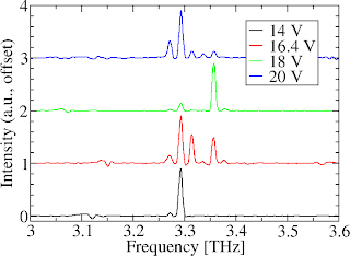
Four distinct lines on a graph, each representing the spectrum at a different voltage. Each line is offset vertically so that they do not overlap.Often, people present a plot that looks something like the one on the right. Here, I measured the emission from a laser, using four different drive voltages. The spectra are a bit different each time, but they are all centred around the same frequency (3.31 THz). I've plotted them all on the same axes by normalising each spectrum (i.e., setting the peak amplitude of each spectrum to 1 unit), and then showing each spectrum offset against the others.

I think most people are perfectly happy with reading data from figures like this one, but there are a couple of issues that I've never been entirely comfortable with:

  1. The vertical scale on the graph is fairly meaningless: the spacing between the 14 V and 16.4 V lines is identical to the spacing between the 16.4 V and 18 V lines, even though the actual step in voltage is bigger in the first case.
  2. The lines in the graph don't intrinsically tell you the full story... for example, you need to look at the legend to understand that "Red line = 16.4 V". Without the legend, the graph would be useless. With the legend, you have more clutter in the image, and an extra mental step to complete before understanding the data.
  3. It's sometimes a bit tricky to see trends in the data. I don't know much about the psychology of this... I guess it's something to do with reading each curve separately and then mentally "post-processing" it to spot a pattern.
One solution is to use a "waterfall plot" or "fence plot" (see MATLAB documentation). This represents the data in three-dimensions, with the curves being stacked in front of each other at a position corresponding to the voltage/temperature/whatever. Pretty useful, but again there are some problems: principally, the figures contain lots of lines, making it quite difficult to represent the data neatly in a journal article where very small figure sizes are needed. Secondly, it's a bit tricky to read the data from a 3D plot: figuring out exactly what the frequency of a peak, and the voltage used isn't easy!

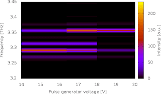
So, I prefer using a kind of spectrogram to represent this sort of data, such as the image to the right. Here, the voltage is shown across the horizontal axis (in a normal spectrogram it would be time), and the frequency of the laser is shown vertically. The brightness of each region of the spectral map shows how intense the emission is at a given frequency, when the laser is driven at the specified voltage.

I'm not advocating this sort of visualisation as being intrinsically better than others, but (a) it's more colourful and can liven up a presentation a bit and (b) personally, I find it quicker to read the data and spot trends. On the down side, it is important to note that the horizontal scale only actually represents four voltage readings. It's easy to make wrong assumptions about the behaviour at other voltages because the colours are painted continuously across the chart.  For example, the chart indicates that the brightest emission line at 15 V will be somewhere just below 3.3 THz. In reality, it could be entirely different; the graph is just filling in the gap in our knowledge with the data we acquired at 14 V.

How to plot spectrograms in Gnuplot

Right, enough waffle. How did I actually generate the image above using Gnuplot?

First, I arranged my data in a file called "spectra-vs-voltage.dat" in the following form:

14 4.49931 0.85137
14 4.49819 0.82508
14 4.49708 0.78786
14 4.49597 0.73671
14 4.49485 0.67282

16.4 4.49931 0.75230
16.4 4.49819 0.84287
16.4 4.49708 0.79419
16.4 4.49597 0.65894
16.4 4.49485 0.48719

So, it's in three columns, containing
  1. Bias voltage (or temperature, or time, or whatever you want on the horizontal scale)
  2. Frequency
  3. Spectral intensity
Note that I have placed a line-break between the data set for each voltage. This is important! Note also that I have only shown the first five values for the first two data sets. You wouldn't want to read the thousand or so frequency points for each of the four spectra! Finally, note that the frequencies are in reverse order in the data sets (i.e., starting at the highest frequency of 4.49931 THz and working backwards.). This is because our spectrometer measures in wavenumbers, and therefore the data appears in reverse in terms of frequency. This isn't important; the plotting method I use doesn't care which way round the data is presented.

I then made a little Gnuplot script in a text editor (VIM), and saved it as "spectral-map.gnuplot". It reads as follows:
#! /usr/bin/gnuplot
set pm3d map
splot 'spectra-vs-voltage.dat'
set terminal png crop
set output 'spectral-map.png'
set xlabel 'Pulse generator voltage [V]'
set ylabel 'Frequency [THz]'
set cblabel 'Intensity [a.u.]'
set cbrange [0 to GPVAL_DATA_Z_MAX]
set xrange [GPVAL_DATA_X_MIN to GPVAL_DATA_X_MAX]
set yrange [3.2 to 3.45]
unset key
replot
unset output

I made the script executable using "chmod +x spectral-map.gnuplot", and then generated the plot by running the script: "./spectral-map.gnuplot". If you care how the script works, or want to modify it, read on. Otherwise, happy plotting :)

Explanation of script

  • The first line is a standard instruction (the "shebang" line), which tells UNIX that this file can be interpreted by Gnuplot.
  • The set pm3d map line sets the plotting style as a 2D colour map of some three-dimensional data
  • The splot 'spectra-vs-voltage.dat' line generates a preliminary plot of the data, without any special formatting. By default, this will normally flash up on your screen, and then disappear when Gnuplot finishes. In fact, I only did this preliminary plot as a bit of a hack so that Gnuplot can figure out the range of the data in the input file. It works fine, but I'm sure there is a better way to do this... flashing unneeded windows around on the screen feels ugly!
  • The set terminal png crop line says that we want the final image to be rendered to a PNG image file, and for any whitespace around the edges to be cropped away.
  • The set output 'spectral-map.png' line instructs Gnuplot to open a file called "spectral-map.png", ready for us to write the image.
  • The set xlabel line (and the following ylabel and cblabel lines) set the labels on the x-axis, the y-axis and the colourbar.
  • The set cbrange line sets the limits of the data to appear in the colourbar. Anything intensities lower than 0 will appear black in the image. The maximum value is obtained using the GPVAL_DATA_Z_MAX variable, which corresponds to the highest intensity value in the preliminary plot we drew in line 3.
  • Similarly, the xrange and yrange commands set the range of data on the x and y-axes.
  • The unset key command hides an annoying line of text in the image containing the data filename.
  • The replot command regenerates the plot, this time using the desired formatting (ranges, labels etc). Note that this time, the plot is written into our PNG output file, rather than to screen because we changed the terminal in line 4.
  • Finally, we have finished writing the image into our PNG output file, so we tell Gnuplot to close it by writing unset output.
That concludes the explanation. Let me know if anything needs clarification!

Friday 8 June 2012

Converting lab equipment data into plain text

I find it mildly irritating that lots of lab equipment (oscilloscopes, network analysers etc) outputs its data in a complex format.  Usually, I just want the data in a plain text format so that I can read and plot it easily.  Often, the data files will come with a load of metadata at the start, and present the "useful bit" of data in a slightly obscure way.

Most plotting packages (Origin, QtiPlot, SciDaVis etc) will let you strip away the unwanted stuff in the file and will accept various data formats (like CSV etc). However, this is still a minor annoyance because each piece of equipment gives data in a different format and you need to configure the input parser differently whenever you read a file from a different machine.

For me, it's even more annoying because my favourite plotting package, xmgrace, only really likes plain text input so the data needs to be parsed into that format before I can open it for plotting.

In this post, I'll give an example of the kind of horrible data that is output from lab equipment, and show how it can be translated into something tidier by using a simple script

Horrible data: an example

As an example, consider the following excerpt of data from one of our Tektronix oscilloscope:

Record Length,2.500000e+03,,  -0.025000000000,   5.40000,
Sample Interval,2.000000e-05,,  -0.024980000000,   5.40000,
Trigger Point,1.250000000000e+03,,  -0.024960000000,   5.40000,
,,,  -0.024940000000,   5.40000,
,,,  -0.024920000000,   5.40000,
,,,  -0.024900000000,   5.40000,
Source,CH1,,  -0.024880000000,   5.40000,
Vertical Units,V,,  -0.024860000000,   5.40000,
Vertical Scale,1.000000e+00,,  -0.024840000000,   5.40000,
Vertical Offset,-3.400000e+00,,  -0.024820000000,   5.40000,
Horizontal Units,s,,  -0.024800000000,   5.40000,
Horizontal Scale,5.000000e-03,,  -0.024780000000,   5.40000,
Pt Fmt,Y,,  -0.024760000000,   5.40000,
Yzero,0.000000e+00,,  -0.024740000000,   5.40000,
Probe Atten,1.000000e+00,,  -0.024720000000,   5.40000,
Model Number,TDS2014B,,  -0.024700000000,   5.40000,
Serial Number,C030757,,  -0.024680000000,   5.40000,
Firmware Version,FV:v22.01,,  -0.024660000000,   5.36000,
,,,-00.024640000000,   5.40000,
,,,-00.024620000000,   5.40000,
,,,-00.024600000000,   5.36000,
,,,-00.024580000000,   5.36000,
,,,-00.024560000000,   5.36000,

Note a few things:
  1. The first 18 lines don't contain any of the data I was measuring. Instead, it's metadata describing how the scope was set up for the measurement, the model of the scope, and so on. This metadata is often very useful, but a lot of plotting packages won't like it being there!
  2. The actual data only starts on line 19 (time and corresponding voltage on the scope). I've only shown 5 lines of the data because the file goes on for 2500 lines. You get the idea, right?
  3. The data is in CSV format. Some plotting packages (e.g., xmgrace) can't handle this.
  4. The data is actually in columns 4 and 5. Columns 1, 2 and 3 are empty. Again, some plotting packages can't handle this.

Solution

The problem can be solved (in linux/unix) by writing a simple script, something like the following:

#! /bin/bash -e

# scope-to-dat - Convert Tektonix oscilloscope CSV data to a plottable table
# (c) Alex Valavanis, University of Leeds 2010


# * Chop off the first 18 lines (i.e settings info)
# * Only use the actual data columns (cols 4 and 5)
# * Replace the comma separators with tabs

tail -n+19 $1 | cut -f4,5 -d',' | tr ',' '\t'


To use the script on a given data file, you'd just say something like

scope-to-dat.sh my_data_file.CSV > plain_text_data.dat


This just takes the scope data from the file "my_data_file.CSV" and outputs it to a new plain-text file called "plain_text_data.dat".

If you don't understand how this script works, read on. It's easy to modify it to handle similar data formats.

Explanation

Only the last line of the script actually does anything.  It consists of three commands that are separated by pipes (the "|" character), meaning that the data is passed between the three commands and "tweaked" into a nicer format at each stage.  I'll explain each of the three commands in the script as follows...

tail -n+19 $1

This first command chops off the header of the file. The "tail" program gives you the last few lines of a file. By default it gives the last 10 lines, but the "-n+19" flag makes it display everything from line 19 onwards instead. The "$1" is the option that was specified when the user runs the script. In this case, it's the CSV data filename.

cut -f4,5 -d','

Having chopped off the header, we now throw away everything except for the 4th and 5th column. The "cut" program is used here... it selects columns from a multi-column file. The "-f4,5" flag means that we want the 4th and 5th columns. The "-d','" flag tells the "cut" program that the data is separated (delimited) by commas.

tr ',' '\t'

Finally, we want to change the data from CSV format to plain text. The "tr" program swaps (or "translates") one character to another. In this case, we tell it to swap every comma in the data to a tab character.
Wednesday 8 September 2010

Curve fitting with gnuplot

Let's say you want to fit a curve to some messy experimental data. You can do this in gnuplot using the following:


# Define the shape of the fitting function. Here, I have used the
# Gauss error function as an example
f(x) = a * erf((x-x0)/b) + c

# Give some initial estimates for the fitting parameters
a = 1600
b = 1
c = 1600
x0 = 45

# This command fits your fitting function to the
# x and y values contained in columns 1 and 2
# of the data file "row-data.dat". The fitting
# parameters are listed after the "via" keyword.
fit f(x) "row-data.dat" using 1:2 via a,b,c,x0

# Plot your scattered data and the fitted curve
# on the same axes for comparison.
plot f(x), "row-data.dat"

# Dump a table of the results to "fit-plot.dat"
set table "fit-plot.dat"
plot f(x), "row-data.dat"
unset table


So, there you have it. This gnuplot script will fit a nice neat curve to your messy data. A log of the fitting process will be saved as "fit.log" and the plotting data will be saved as
"fit-plot.dat".

Quite often, you'll need to play with the initial estimates in order to get a good fit but
usually this works first time.

Wednesday 17 March 2010

Options in bash scripts part 2

Here's a little demo script I wrote, which reads a couple of options from the command line and performs some basic error checking.  It also makes use of regex matching using

if [[ $test_variable =~ $a_regular_expression ]]; then
  # you have matched the regular expression
else
  # you haven't matched the regular expression
fi

Here's the script:

#! /bin/bash

#TODO: Fill in help message
usage()
{
cat << EOF
usage: $0 FILENAME NPROCS options

This script reads command-line args and dumps them to stdout

# describe arguments here

OPTIONS:
 -t    blah
 -r    blah
EOF
}

# Set default values for variables
ram=1G
time="48:00:00"

#TODO: This time format only specifies that times are
#  numbers up to 49:00:00.  Correct this so that
#  only times up to 48:00:00 are allowed
time_format='[0-4][0-9]:[0-5][0-9]:[0-5][0-9]'

# Read command-line arguments and set variables
while getopts "r:t:h?" OPTION
do
 case $OPTION in
  ?)
   usage
   exit 1
   ;;
  h)
   usage
   exit 1
   ;;
  r)
   ram="$OPTARG"G

   # TODO: Check that ram is an integer
   #  within the range 1-12

   # Remove "used" argument
   shift $((OPTIND-1)); OPTIND=1
   ;;
  t)
   time=$OPTARG

   # Check that time format is correct
   if [[ $OPTARG =~ $time_format ]]; then
    time=$OPTARG
   else
    echo "ERROR: Time format wrong"
    exit
   fi

   # Remove "used" argument
   shift $((OPTIND-1)); OPTIND=1
   ;;
 esac
done

filename=$1
# TODO: Check that filename is a valid file identifier

nprocs=$2
# TODO: Check that nprocs is a valid integer

# Dump all variable values to stdout
echo time=$time
echo ram=$ram
echo filename=$filename
echo nprocs=$nprocs